BR
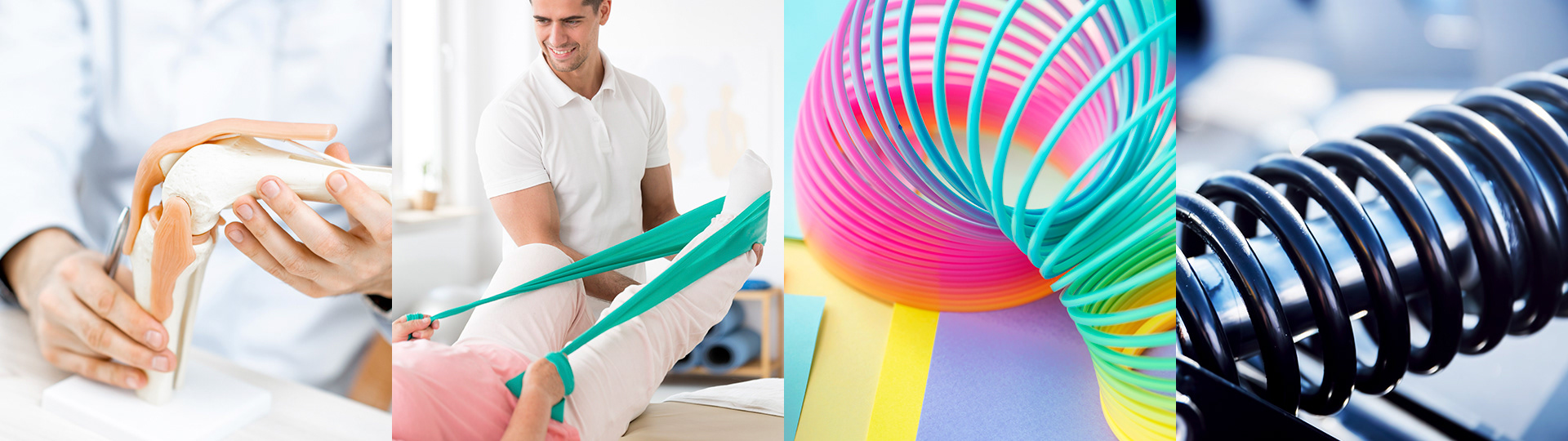
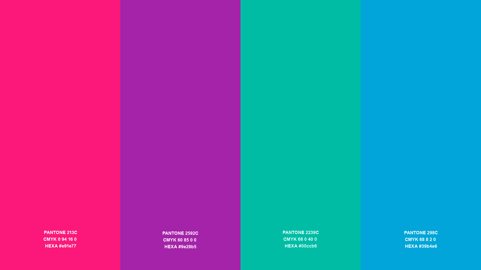
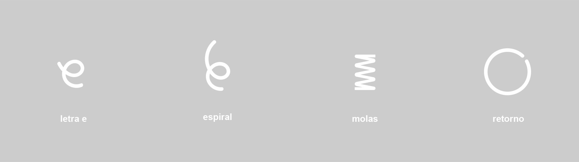
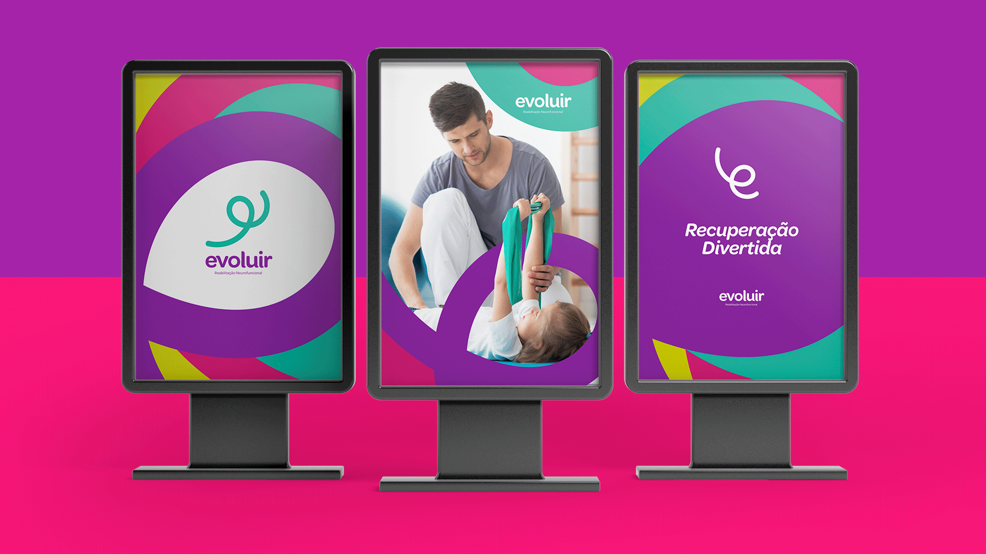
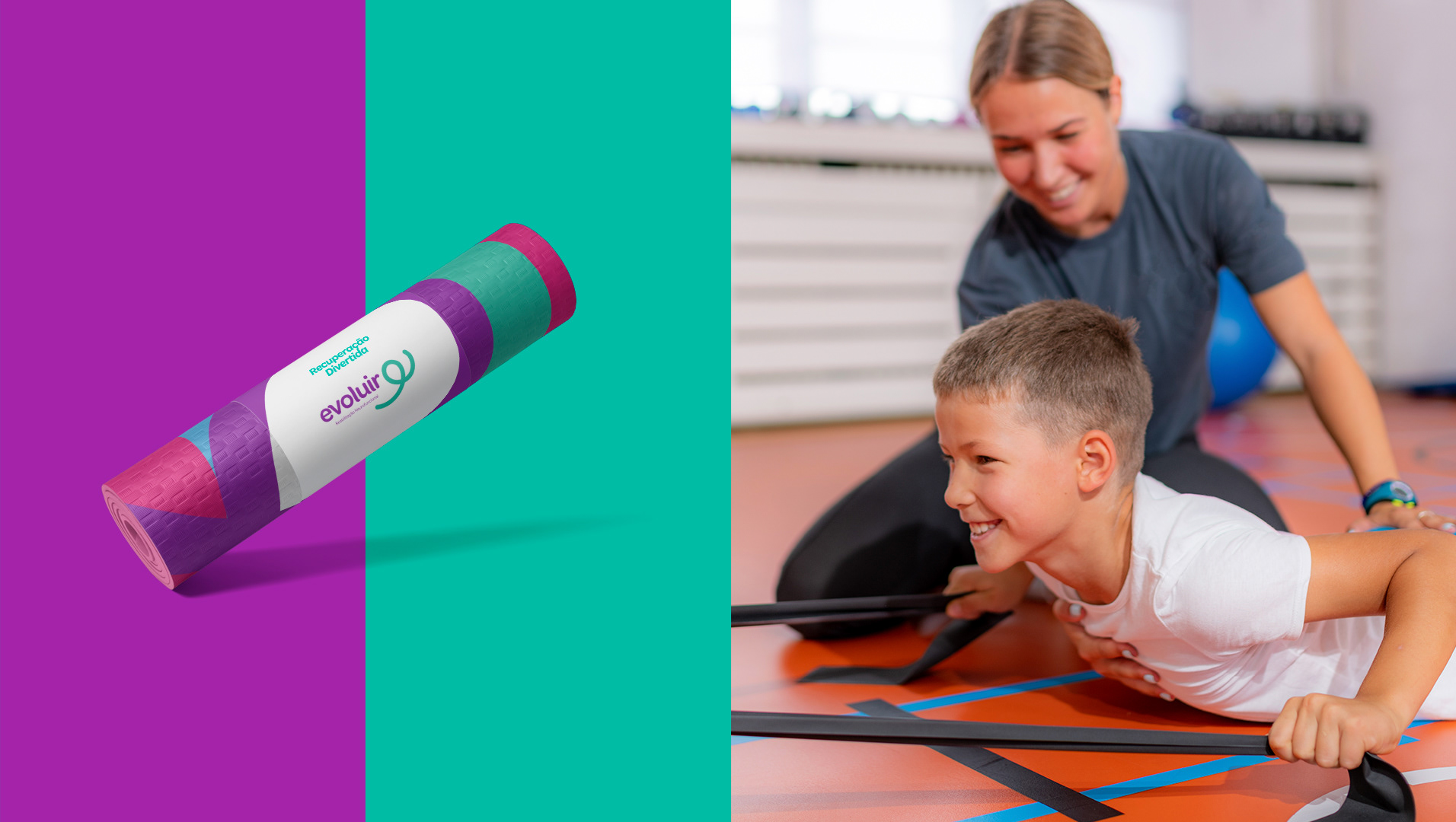
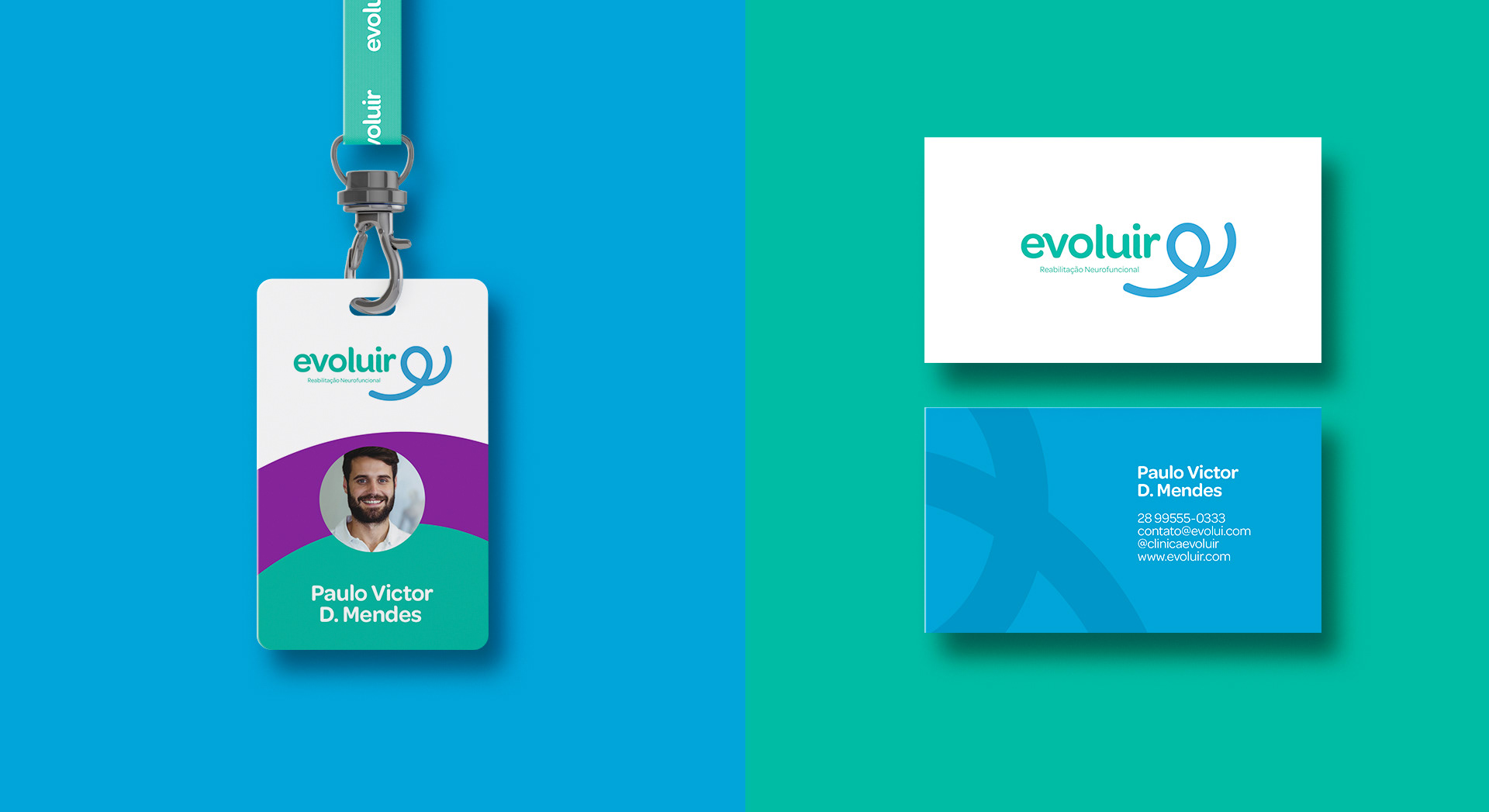
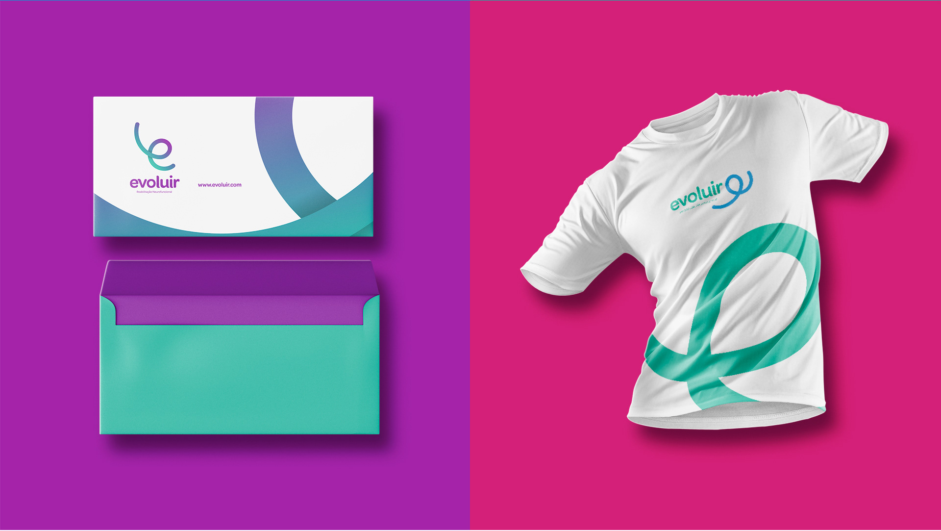
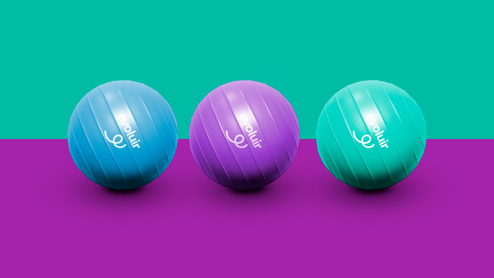
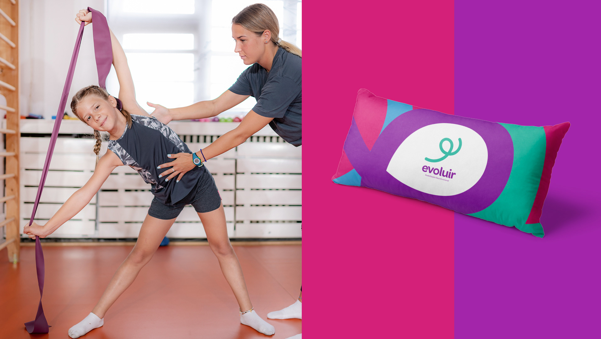
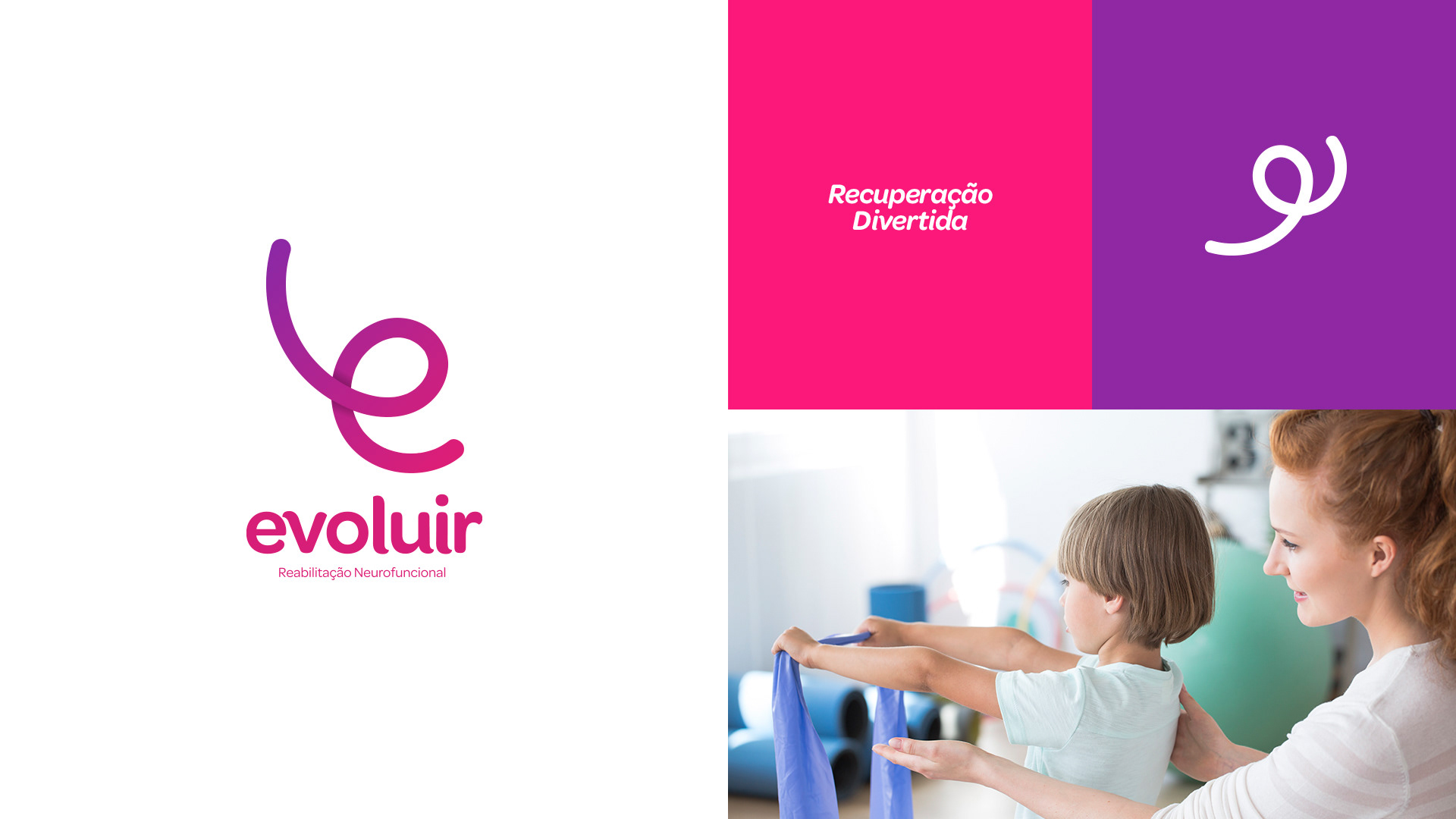
Desenvolvida para uma clínica de fisioterapia e reabilitação infantil, cujo intuito é a melhoria e evolução positiva do quadro do paciente, a identidade visual é composta de cores alegres, vivas, que trazem alegria, esperança e humanizam a marca e a aproximam do cliente, ou melhor, do paciente. O símbolo, que tem muita versatilidade e dinamismo de aplicação, remete à fita fisioterápica e à mola, itens conceituais e reais na evolução do paciente, que é o propósito de existência da empresa.
EN
-
-
Developed for a physiotherapy and rehabilitation clinic for children, whose aim is the improvement and positive evolution of the patient's condition, the visual identity is composed of cheerful, bright colors that bring joy, hope and humanize the brand and bring it closer to the client, or rather, the patient. The symbol, which has a lot of versatility and dynamism of application, refers to the physiotherapy tape and the spring, conceptual and real items in the evolution of the patient, which is the purpose of the company's existence.