BR
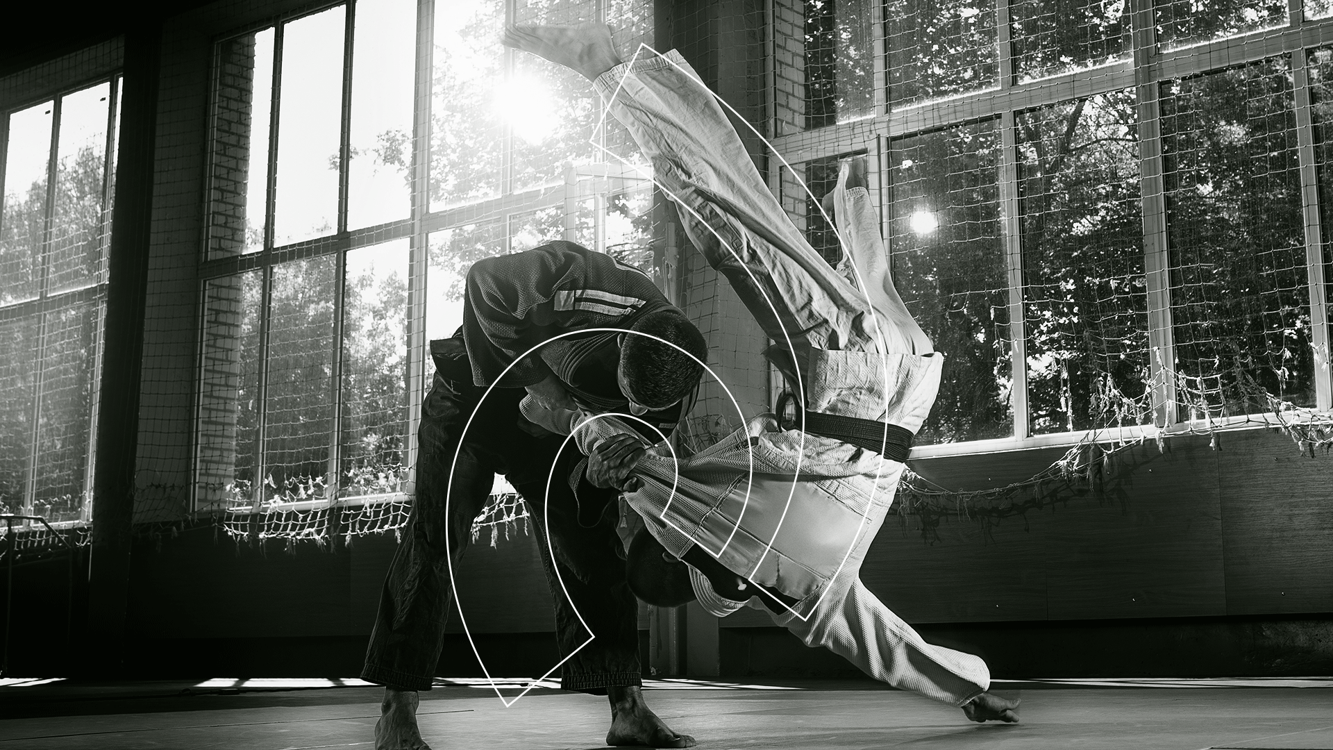
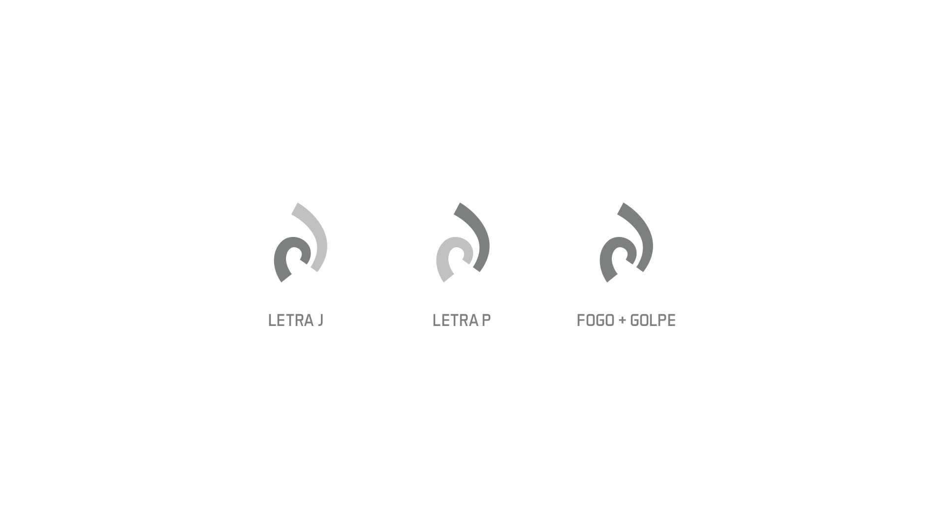
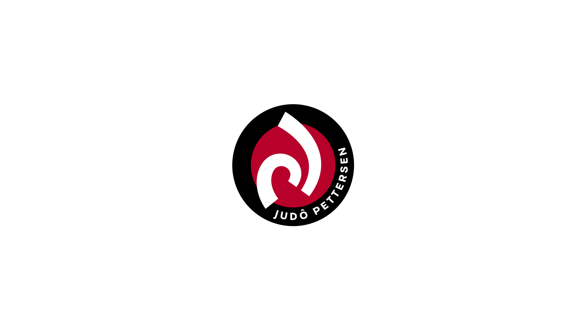
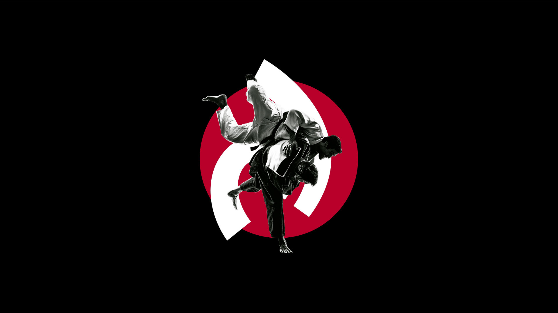
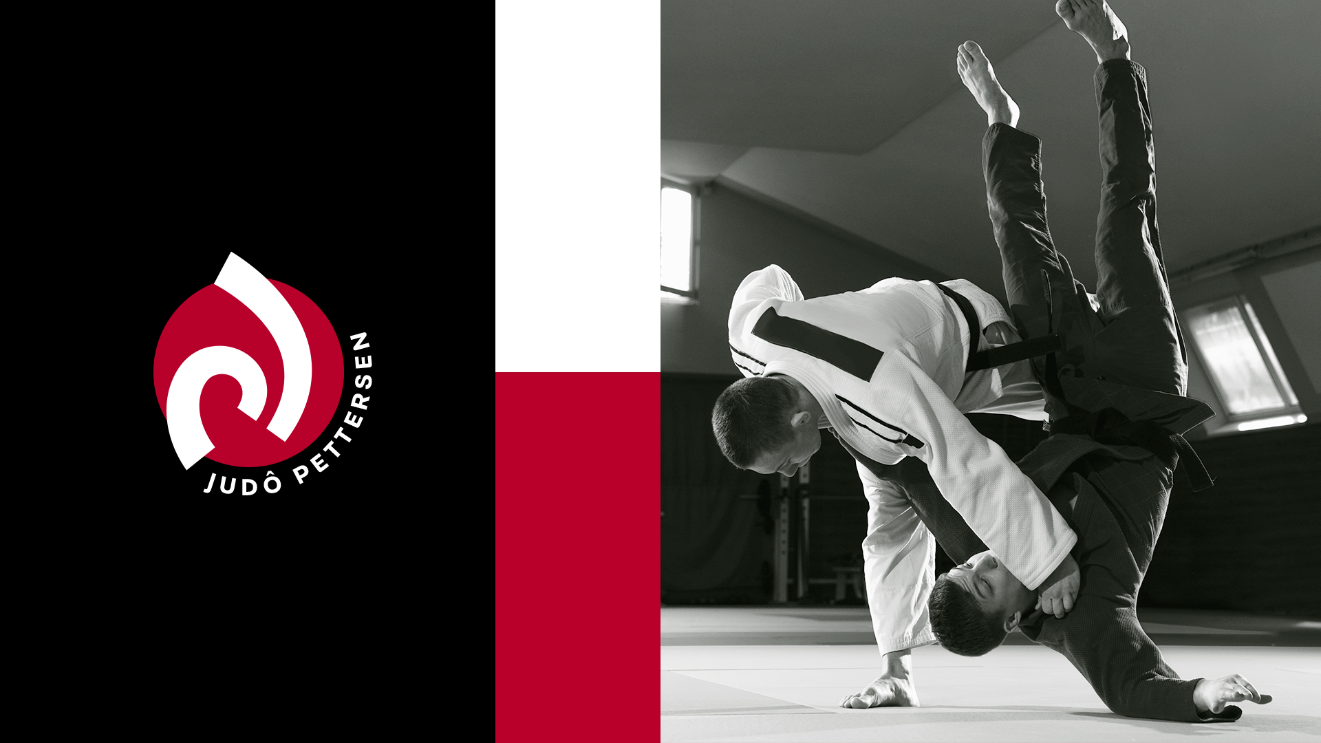
O judô é a arte do caminho suave e da amizade e prosperidade mútuas. E foi com base nestas filosofias que a marca do Judô Pettersen ganhou forma, e movimento. O símbolo foi desenvolvido com o objetivo de conter 3 importantes significados: a letra “J”, de judô, a letra “P”, de Pettersen, e o movimento de “golpe com queda”. Além disso, inserimos o significado do “fogo”, que representa a “luz do conhecimento”, a “chama da esperança” e o “calor da humanidade”. A cor vermelha reforça essa ideia de calor e remete ao sol presente na bandeira do Japão, país de origem do judô. E a cor preta simboliza a sabedoria e qualidade da marca Judô Pettersen no ensino do judô infantil nas escolas, academias e clubes.
EN
-
-
Judo is the art of the gentle way and of mutual friendship and prosperity. And it was based on these philosophies that the Pettersen Judo mark took shape, and movement. The symbol was developed in order to contain 3 important meanings: the letter "J" for judo, the letter "P" for Pettersen, and the movement of "strike and fall". In addition, we inserted the meaning of "fire", which represents the "light of knowledge", the "flame of hope", and the "heat of humanity". The color red reinforces this idea of heat and refers to the sun present in the Japanese flag, the country of origin of Judo. And the black color symbolizes the wisdom and quality of the Pettersen Judo brand in teaching children judo in schools, academies, and clubs.