BR
-
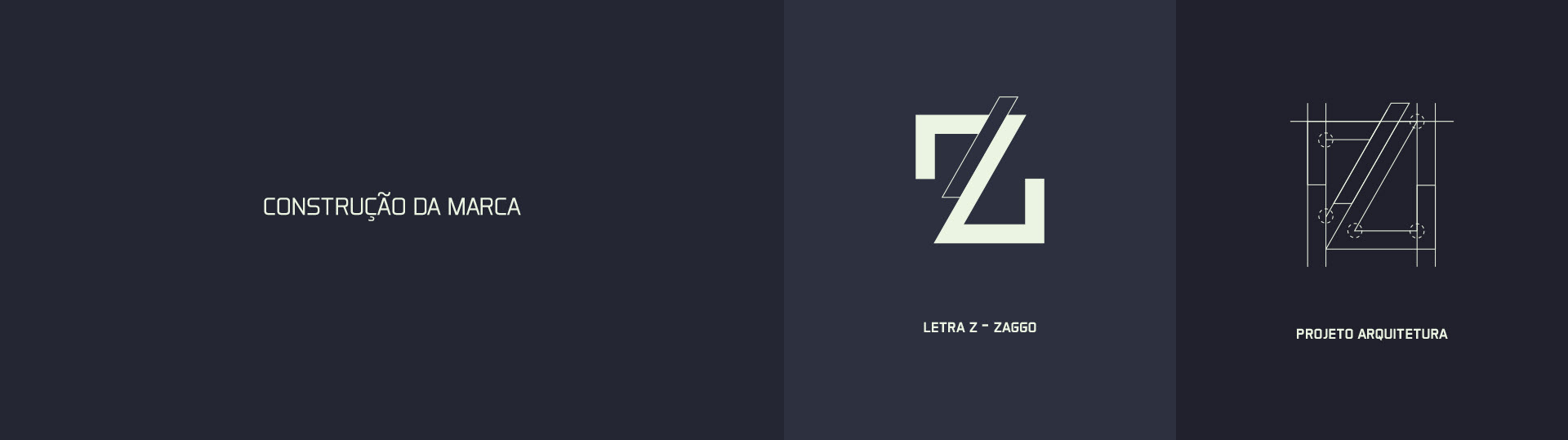
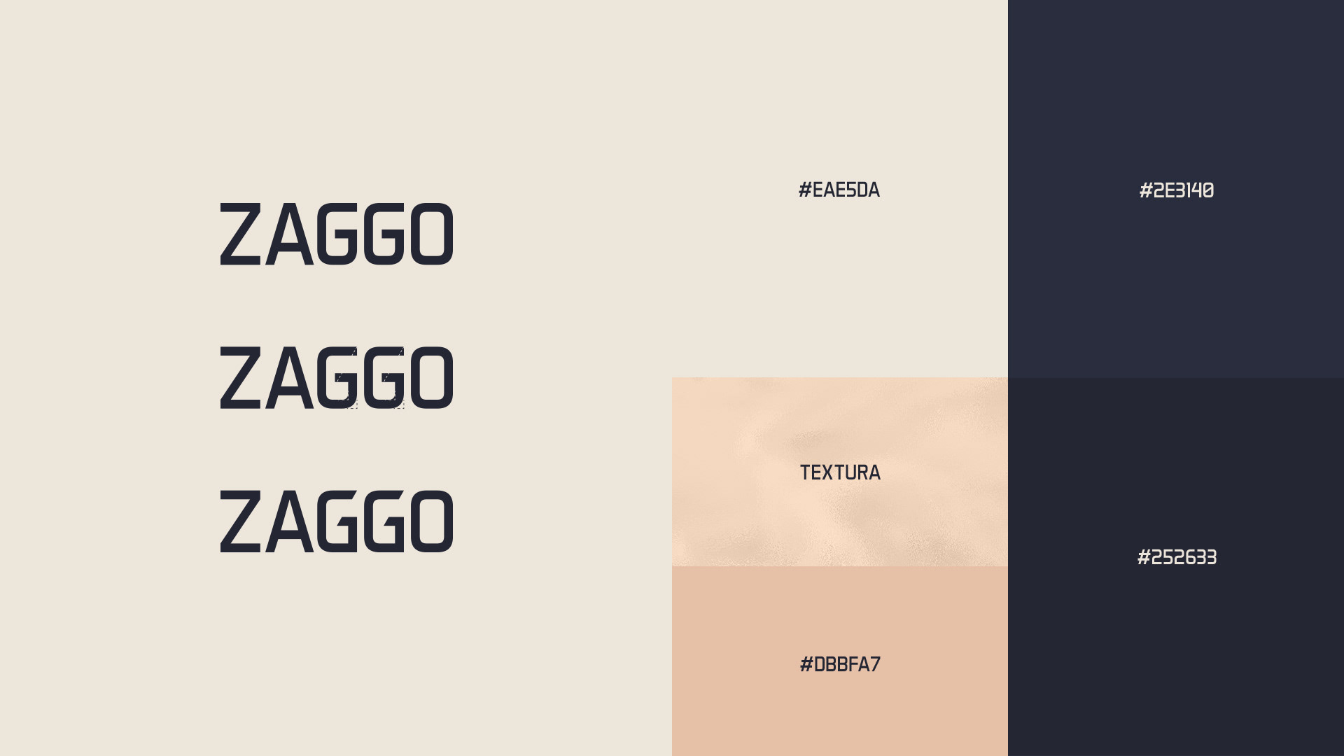
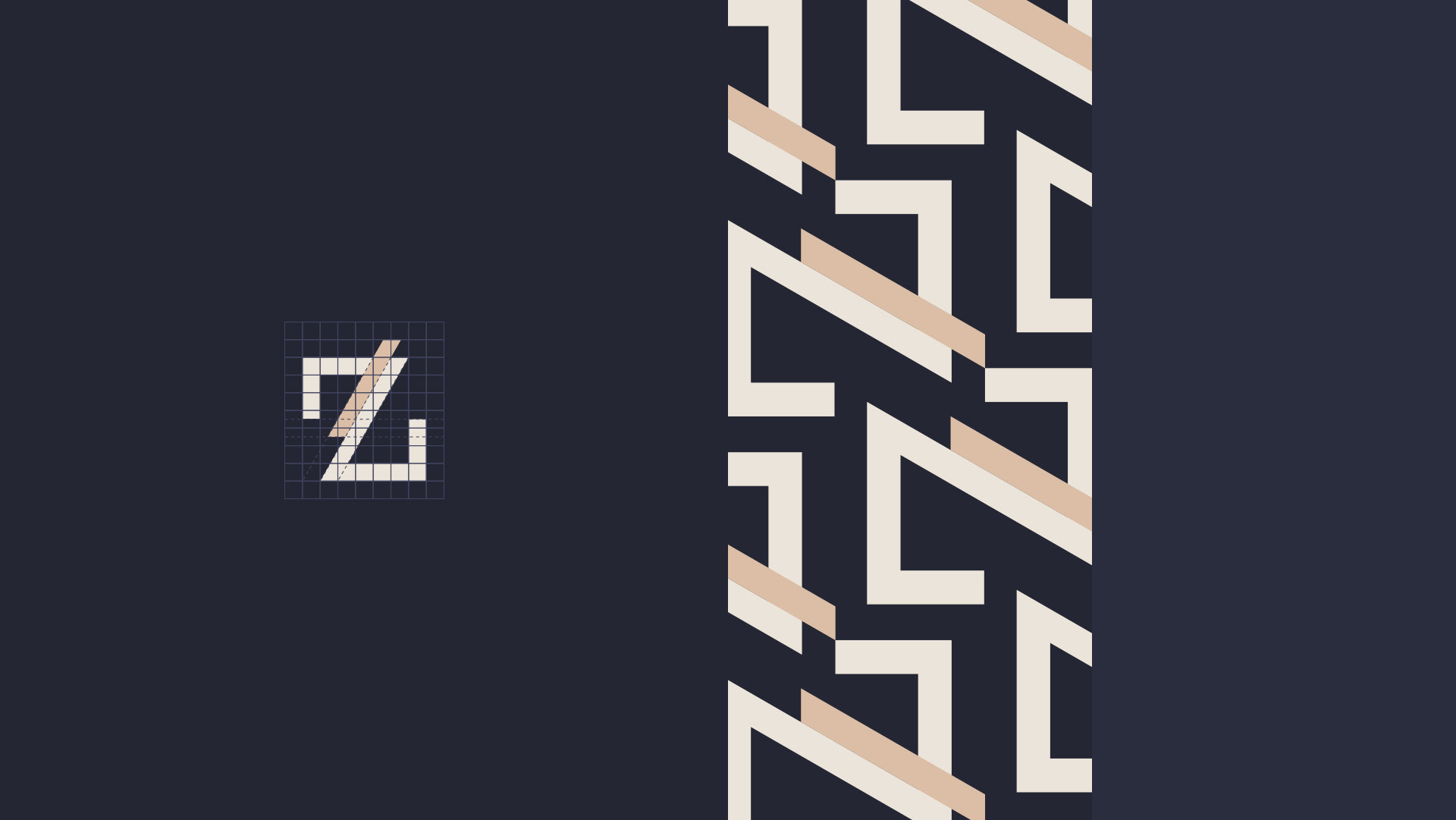
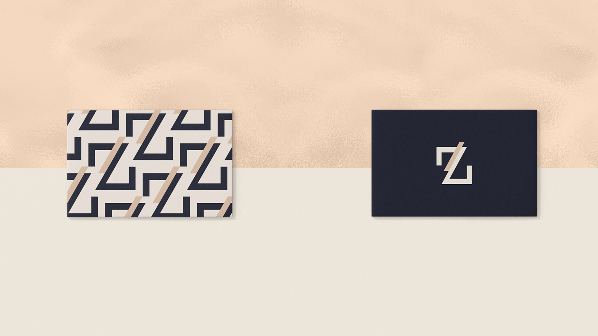
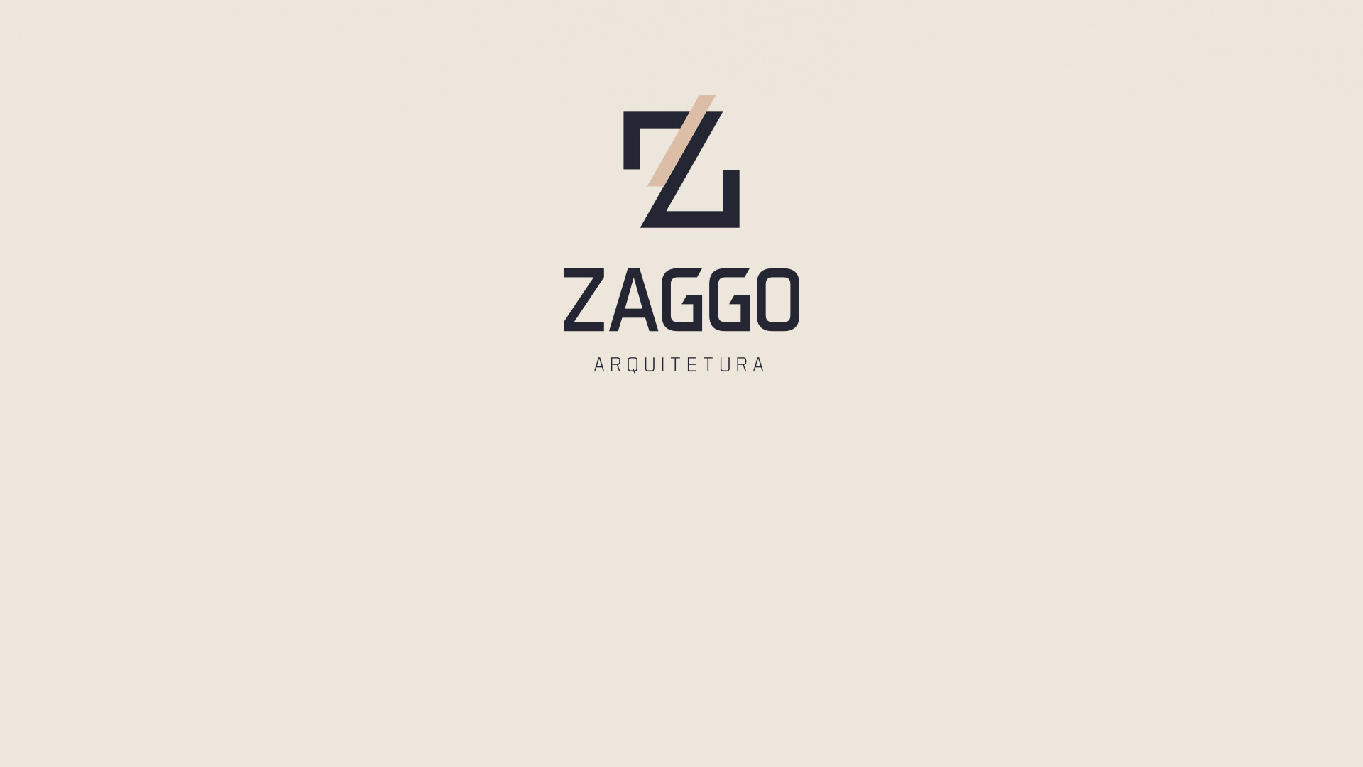
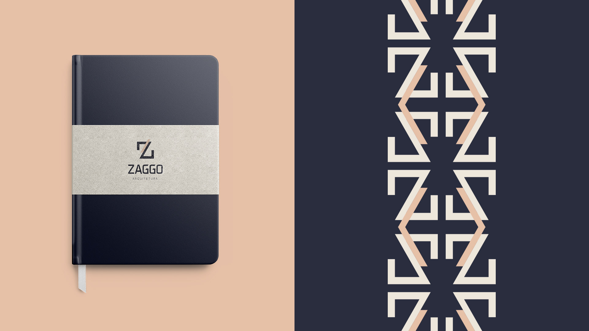
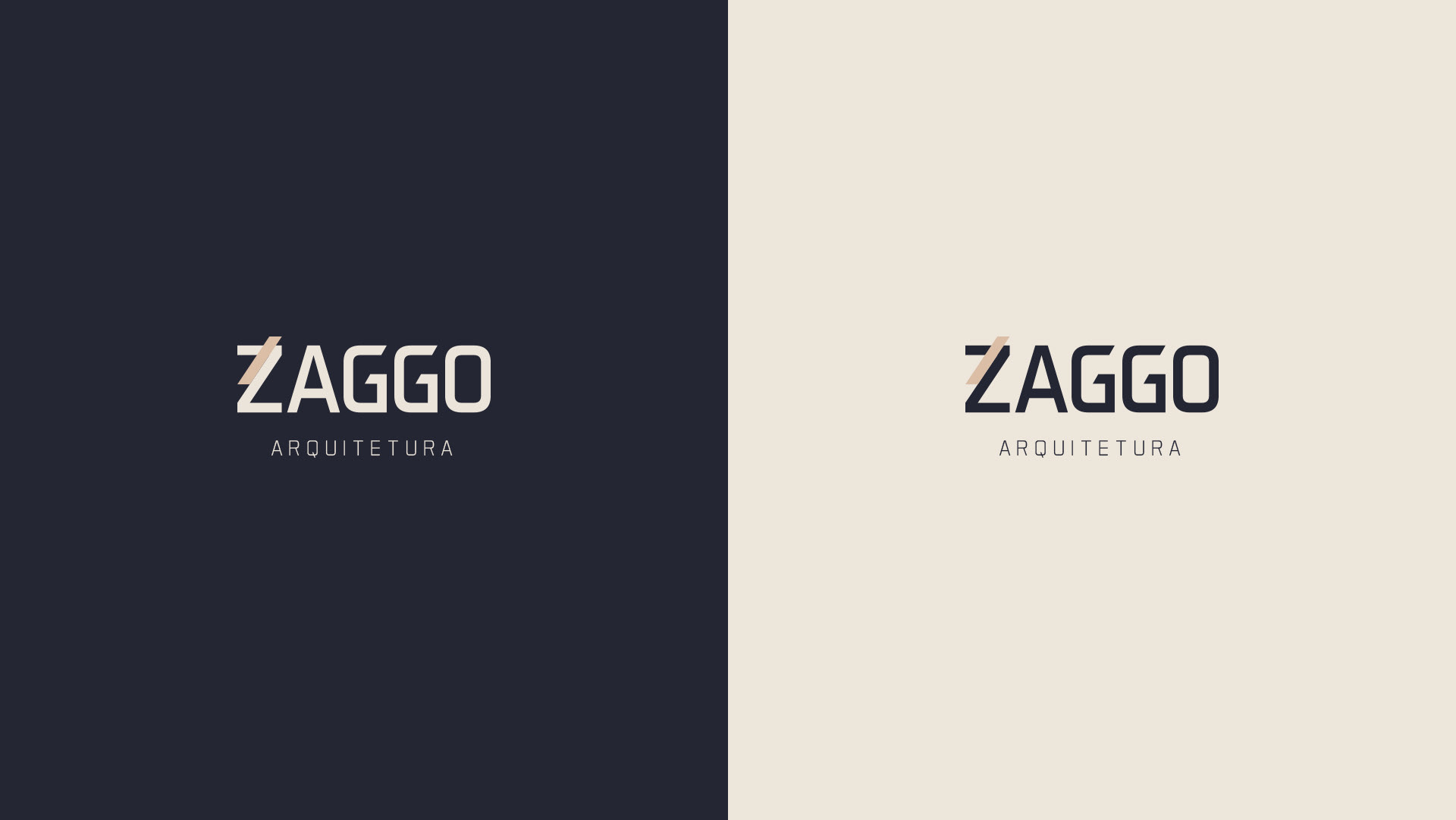
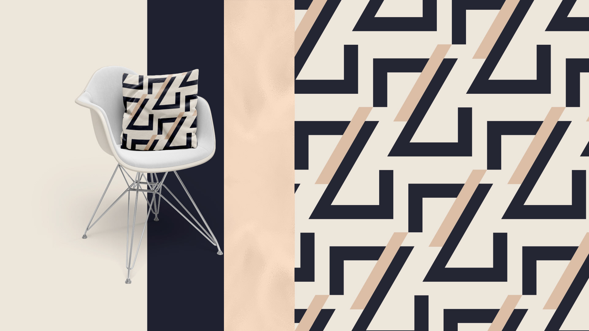
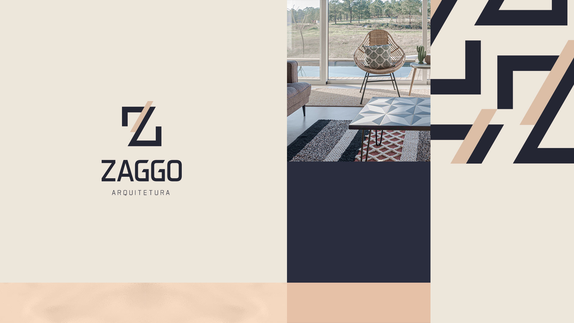
O verdadeiro “girl power”. A maca da Zaggo Arquitetura é forte e ao mesmo tempo delicado, representando a força feminina da dona, que cuida de cada detalhe da empresa. Tem como ícone a letra Z do nome, construído de forma moderna e elegante, representando bem o conceito da empresa. A identidade da marca acompanha ainda estampas e padrões que dão mais personalidade e estilo.
-
O verdadeiro “girl power”. A maca da Zaggo Arquitetura é forte e ao mesmo tempo delicado, representando a força feminina da dona, que cuida de cada detalhe da empresa. Tem como ícone a letra Z do nome, construído de forma moderna e elegante, representando bem o conceito da empresa. A identidade da marca acompanha ainda estampas e padrões que dão mais personalidade e estilo.
EN
-
-
The real girl power. Zaggo Arquitetura's stretcher is strong and at the same time delicate, representing the owner's feminine strength, who takes care of every detail of the company. Its icon is the letter Z of the name, built in a modern and elegant way, representing well the concept of the company. The identity of the brand also accompanies prints and patterns that give more personality and style.